This function allows for using available cell metadata, feature
expression or factor loading to generate violin plot, and grouping the data
with available categorical cell metadata. Available categorical cell metadata
can be used to form the color annotation. When it is different from the
grouping, it forms a nested grouping. Multiple y-axis variables are allowed
from the same specification of slot, and this returns a list of violin
plot for each. Users can further split the plot(s) by grouping on cells (e.g.
datasets).
Usage
plotCellViolin(
  object,
  y,
  groupBy = NULL,
  slot = c("cellMeta", "rawData", "normData", "scaleData", "H.norm", "H"),
  yFunc = NULL,
  cellIdx = NULL,
  colorBy = NULL,
  splitBy = NULL,
  titles = NULL,
  ...
)
Arguments
- object
liger object
- y
Available variable name in
slotto look for the value to visualize.- groupBy, colorBy
Available variable name in
cellMetaslot to look for categorical grouping. See details. DefaultNULLproduces no grouping and all-black graphic elements.- slot
Choose the slot to find the
yvariable. See Details. Default"cellMeta".- yFunc
A function object that expects a vector/factor/data.frame retrieved by
yas the only input, and returns an object of the same size, so that the y-axis is replaced by this output. Useful when, for example, users need to scale the gene expression shown on plot.- cellIdx
Character, logical or numeric index that can subscribe cells. Missing or
NULLfor all cells.- splitBy
Character vector of categorical variable names in
cellMetaslot. Split all cells by groupings on this/these variable(s) to produce a violin plot containing only the cells in each group. DefaultNULL.- titles
Title text. A character scalar or a character vector with as many elements as multiple plots are supposed to be generated. Default
NULL.- ...
Arguments passed on to
.ggCellViolin,.ggplotLigerThemeviolin,box,dotLogical, whether to add violin plot, box plot or dot (scatter) plot, respectively. Layers are added in the order of dot, violin, and violin on the top surface. By default, only violin plot is generated.
violinAlpha,boxAlphaNumeric, controls the transparency of layers. Default
0.8,0.6, respectively.violinWidth,boxWidthNumeric, controls the width of violin/box bounding box. Default
0.9and0.4.dotColor,dotSizeNumeric, globally controls the appearance of all dots. Default
"black"andgetOption("ligerDotSize")(1).xlabAngleNumeric, counter-clockwise rotation angle of X axis label text. Default
45.rasterLogical, whether to rasterize the dot plot. Default
NULLautomatically rasterizes the dot plot when number of total cells to be plotted exceeds 100,000.seedRandom seed for reproducibility. Default
1.title,subtitle,xlab,ylabMain title, subtitle or X/Y axis title text. By default, no main title or subtitle will be set, and X/Y axis title will be the names of variables used for plotting. Use
NULLto hide elements.TRUEforxlaborylabshows default values.legendFillTitleLegend title text for fill aesthetics, often used for violin, box, bar plots. Default
NULLshows the original variable name.showLegendWhether to show the legend. Default
TRUE.legendPositionText indicating where to place the legend. Choose from
"top","bottom","left"or"right". Default"right".baseSizeOne-parameter control of all text sizes. Individual text element sizes can be controlled by other size arguments. "Title" sizes are 2 points larger than "text" sizes when being controlled by this.
titleSize,xTitleSize,yTitleSize,legendTitleSizeSize of main title, axis titles and legend title. Default
NULLcontrols bybaseSize + 2.subtitleSize,xTextSize,yTextSize,legendTextSizeSize of subtitle text, axis texts and legend text. Default
NULLcontrols bybaseSize.panelBorderWhether to show rectangle border of the panel instead of using ggplot classic bottom and left axis lines. Default
FALSE.colorLabelsCharacter vector for modifying category names in a color legend. Passed to
ggplot2::scale_color_manual(labels). DefaultNULLuses original levels of the factor.colorValuesCharacter vector of colors for modifying category colors in a color legend. Passed to
ggplot2::scale_color_manual(values). DefaultNULLuses internal selected palette when <= 26 categories are presented, otherwise ggplot hues.legendNRow,legendNColInteger, when too many categories in one variable, arranges number of rows or columns. Default
NULL, automatically split toceiling(levels(variable)/10)columns.plotlyWhether to use plotly to enable web based interactive browsing for the plot. Requires installation of package "plotly". Default
FALSE.
Value
A ggplot object when a single plot is intended. A list of ggplot
objects, when multiple y variables and/or splitBy are set. When
plotly = TRUE, all ggplot objects become plotly (htmlwidget) objects.
Details
Available option for slot include: "cellMeta",
"rawData", "normData", "scaleData", "H.norm"
and "H". When "rawData", "normData" or
"scaleData", y has to be a character vector of feature names.
When "H.norm" or "H", colorBy can be any valid index to
select one factor of interests. Note that character index follows
"Factor_[k]" format, with replacing [k] with an integer.
When "cellMeta", y has to be an available column name in
the table. Note that, for y as well as groupBy, colorBy
and splitBy since a matrix object is feasible in cellMeta
table, using a column (e.g. named as "column1" in a certain matrix
(e.g. named as "matrixVar") should follow the syntax of
"matrixVar.column1". When the matrix does not have a "colname"
attribute, the subscription goes with "matrixVar.V1",
"matrixVar.V2" and etc. These are based on the nature of
as.data.frame method on a DataFrame object.
groupBy is basically send to ggplot2::aes(x), while
colorBy is for the "colour" aesthetics. Specifying colorBy
without groupBy visually creates grouping but there will not be
varying values on the x-axis, so boxWidth will be forced to the same
value as violinWidth under this situation.
Examples
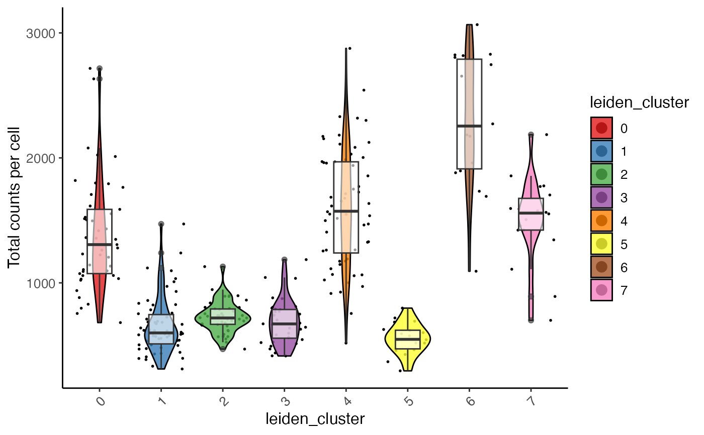
plotCellViolin(pbmcPlot, y = "nUMI", groupBy = "dataset", slot = "cellMeta")
 plotCellViolin(pbmcPlot, y = "nUMI", groupBy = "leiden_cluster",
slot = "cellMeta", splitBy = "dataset",
colorBy = "leiden_cluster",
box = TRUE, dot = TRUE,
ylab = "Total counts per cell",
colorValues = RColorBrewer::brewer.pal(8, "Set1"))
#> $nUMI.ctrl
plotCellViolin(pbmcPlot, y = "nUMI", groupBy = "leiden_cluster",
slot = "cellMeta", splitBy = "dataset",
colorBy = "leiden_cluster",
box = TRUE, dot = TRUE,
ylab = "Total counts per cell",
colorValues = RColorBrewer::brewer.pal(8, "Set1"))
#> $nUMI.ctrl
 #>
#> $nUMI.stim
#>
#> $nUMI.stim
 #>
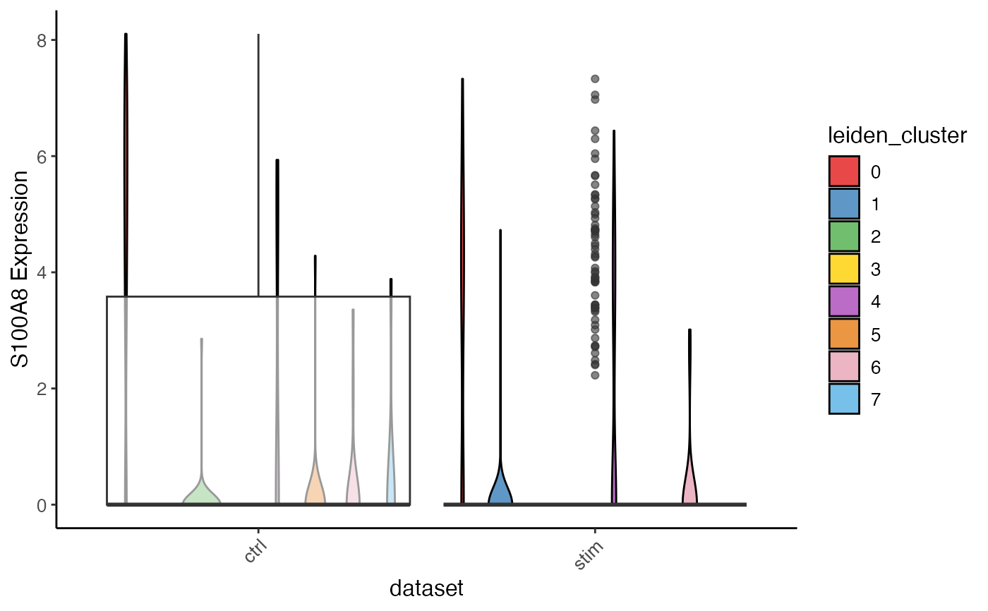
plotCellViolin(pbmcPlot, y = "S100A8", slot = "normData",
yFunc = function(x) log2(10000*x + 1),
groupBy = "dataset", colorBy = "leiden_cluster",
box = TRUE, ylab = "S100A8 Expression")
#>
plotCellViolin(pbmcPlot, y = "S100A8", slot = "normData",
yFunc = function(x) log2(10000*x + 1),
groupBy = "dataset", colorBy = "leiden_cluster",
box = TRUE, ylab = "S100A8 Expression")